"ATTACK OF THE BLOODSUCKERS" EXHIBIT, ECOTARIUM MUSEUM, FALL 2006
This was without a doubt the most difficult illustration project I have ever worked on. I had only just started to learn Adobe Illustrator when it became clear that I would need to use the program exclusively for the next seven months or so. It was quite a challenge, but the results were well worth the vision we had during our initial meetings last April. Thanks to the EcoTarium Museum's exhibit design staff, Jane's Trust Foundation, my friend Andrew Tang, and Chris Danemayer of Proun Design, I am now completely proficient in one of Adobe's more complicated design programs, not to mention the "Marvel Romance Comic Book" style the exhibit manifested itself under graphically. I also know way more about designing for print than I would care to, especially when it comes to limited Pantone pallets and transparencies!
Leeches Poster ("Creature From the Black Lagoon" spoof)
(displayed next to the leeches tank)
Click on images to see detail
"Swamp Water Ballet" Poster
(displayed next to the mosquito breeding tank)
This is the strangest concept I have ever been asked to illustrate: "Synchronized swimming in a swamp with a mosquito larvae water ballet." I did the best I could.
Click on images to see detail
Alternative Graphic/Illustrative Style Samples for the Bloodsuckers Exhibit
These two illustrations were both rejected graphic styles I came up with for the exhibit. We thought the "Edward Gorey" style was too creepy and problematically uncolorful, and the "1950's Horror Poster" style too scary. What we ended up with was a "Marvel Romance Comic Book" style with horror poster concepts.
"TREEHOUSES" EXHIBIT, ECOTARIUM MUSEUM, SPRING 2006
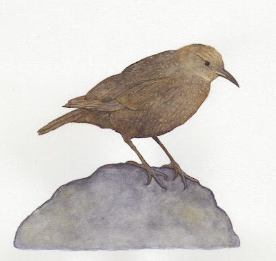
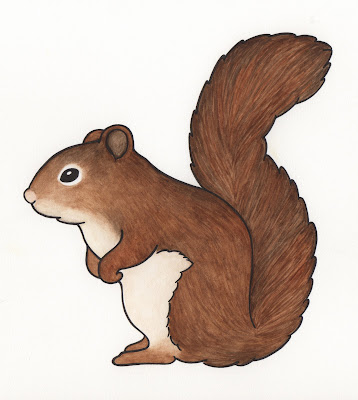
I wish I could say that I helped design the structural look of this exhibit (which is one of the most beautiful I've seen the EcoTarium create thus far), but alas, I only served to illustrate the tree-dwellers in the interactive components. Still, this is by far my favorite exhibit in terms of aesthetics and overall conceptualization.
Watch a short video of the exhibit!
Subscribe to:
Posts (Atom)